
01
One orange, used carefully.
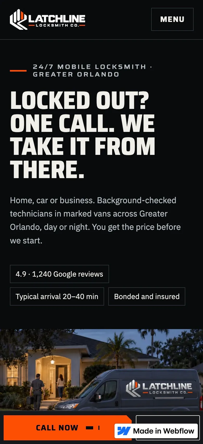
Signal orange (#FD4F00) was sampled from the flat logo files. Call buttons use black text on Signal (5.94:1), never white. On light surfaces, orange text switches to a darker Signal Ink so it stays readable.
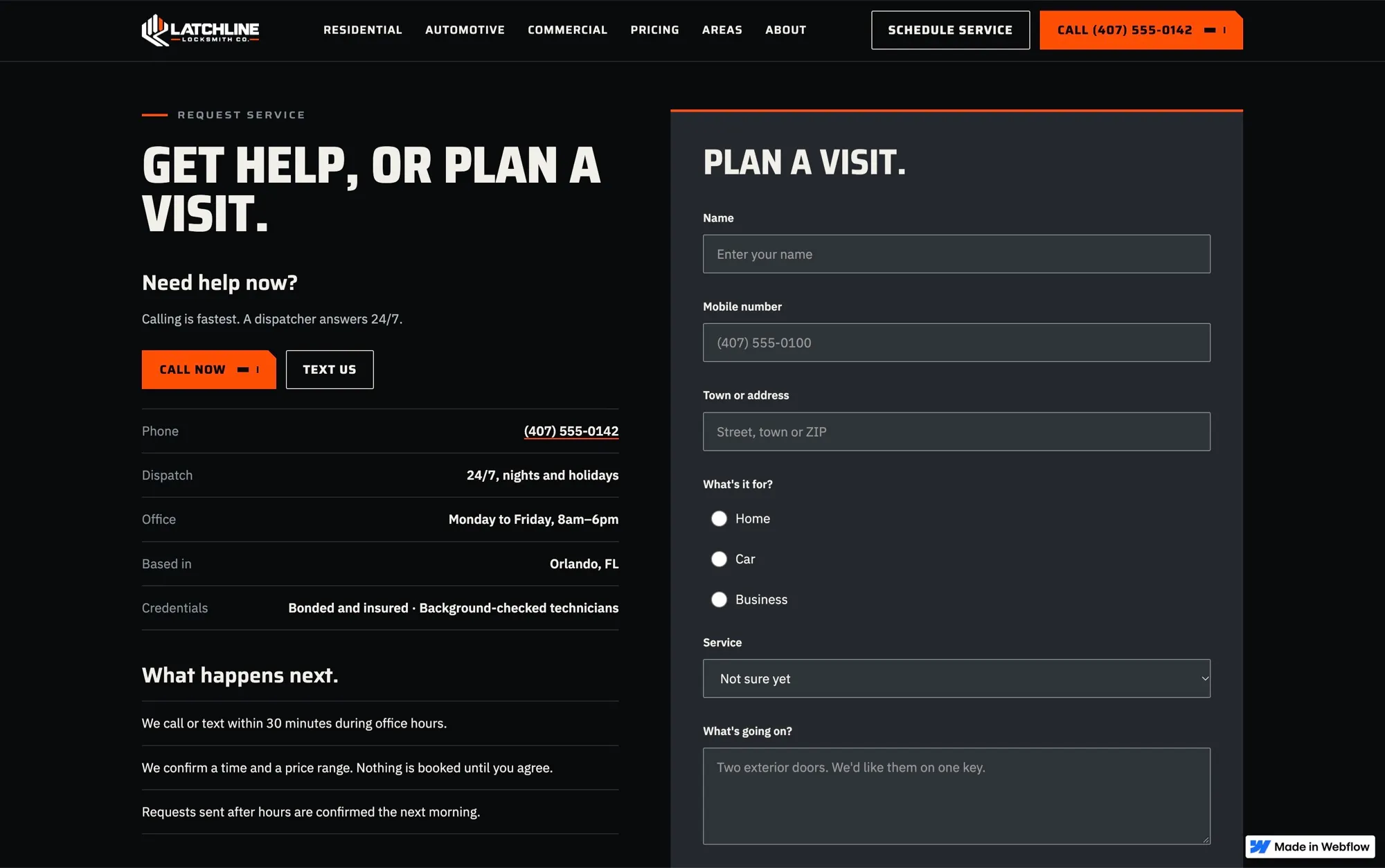
 Latchline Locksmith Co.Brand foundations
A locksmith brand has to read as trustworthy at a glance, at night, on a phone. Every color pairing was checked before it was allowed near a button.
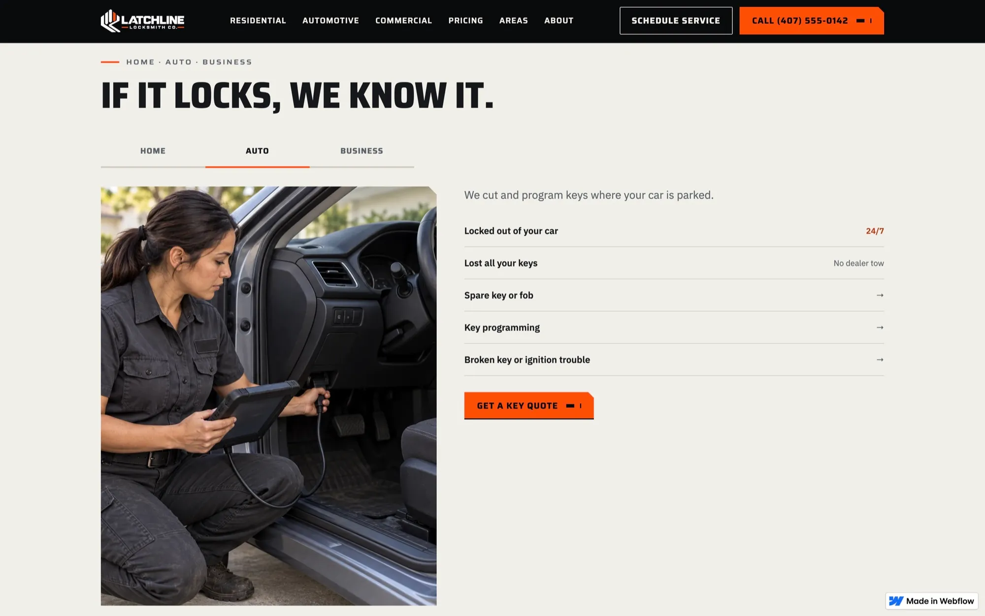
The problem
The supplied logo came with a single orange and no rules. White text on that orange fails contrast (3.34:1), and an orange that bright can't be used as text on a light background. The brand needed a system that keeps the orange loud and the text readable.
Signal orange (#FD4F00) was sampled from the flat logo files. Call buttons use black text on Signal (5.94:1), never white. On light surfaces, orange text switches to a darker Signal Ink so it stays readable.
Night (lock black), Steel (machined charcoal) and Day (bone) give the long pages a rhythm, and each surface has its own tested text and line colors.
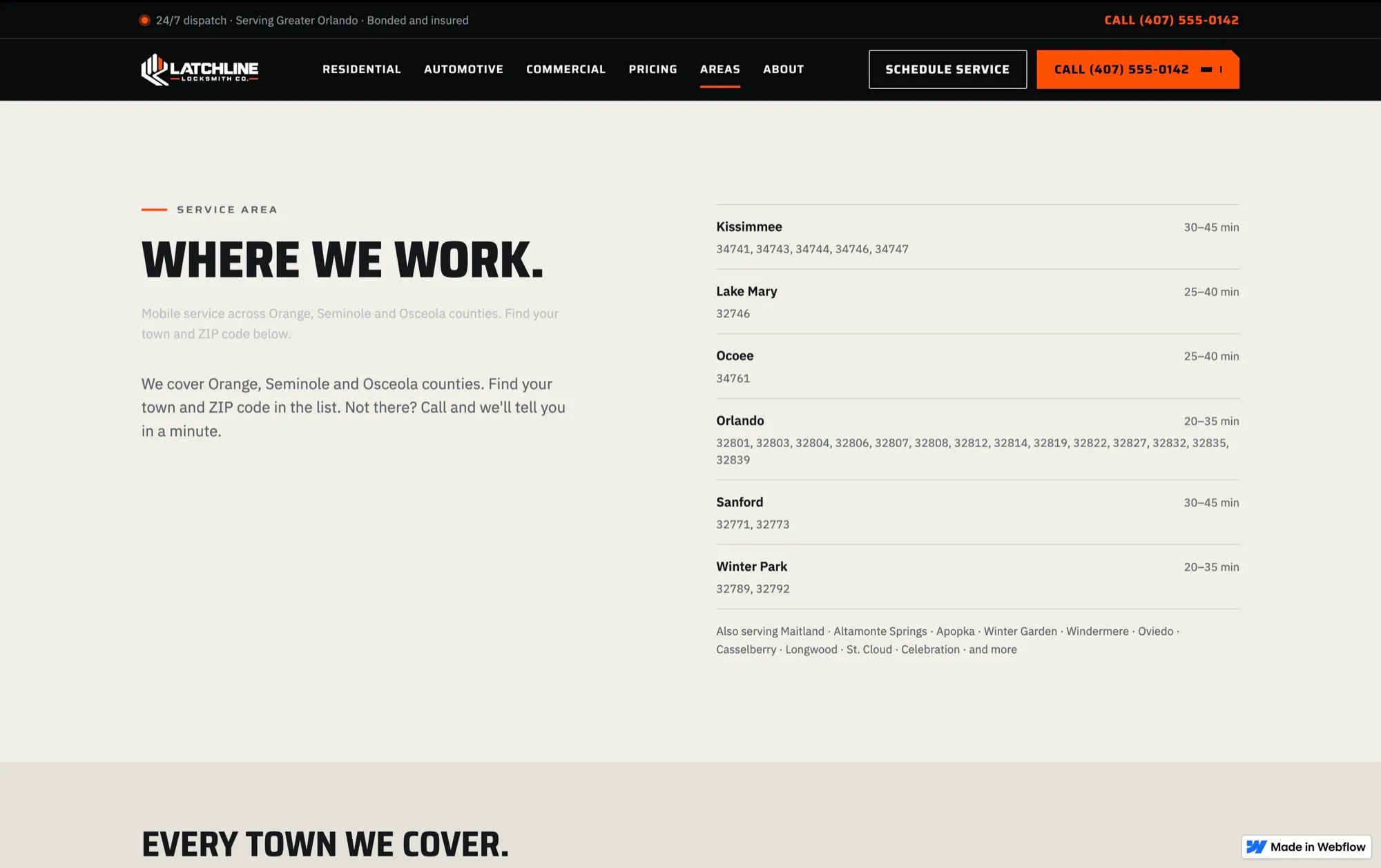
Saira, a variable condensed face, carries the uppercase headlines; IBM Plex Sans carries the reading. The signature shape is a clipped top-right corner, taken from the angle of the logo's rails and used on just four kinds of element.
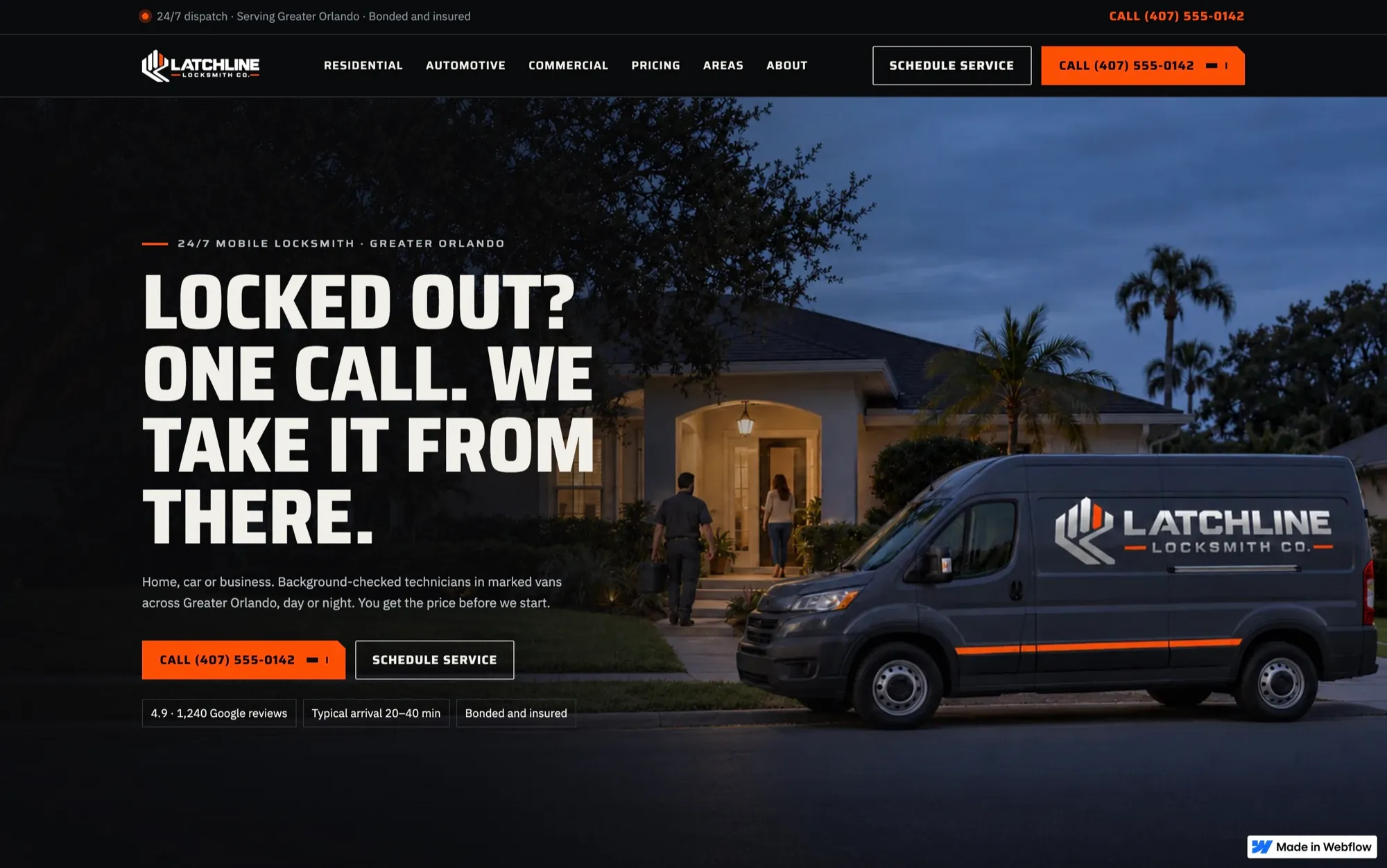
Brand foundations
How it was built
Thirteen color tokens, two type families, a type scale for desktop and mobile, a 4px spacing base and a 12-column grid, all set up as Webflow variables.
A few questions, or just call. Either way, you're talking to me.