The problem
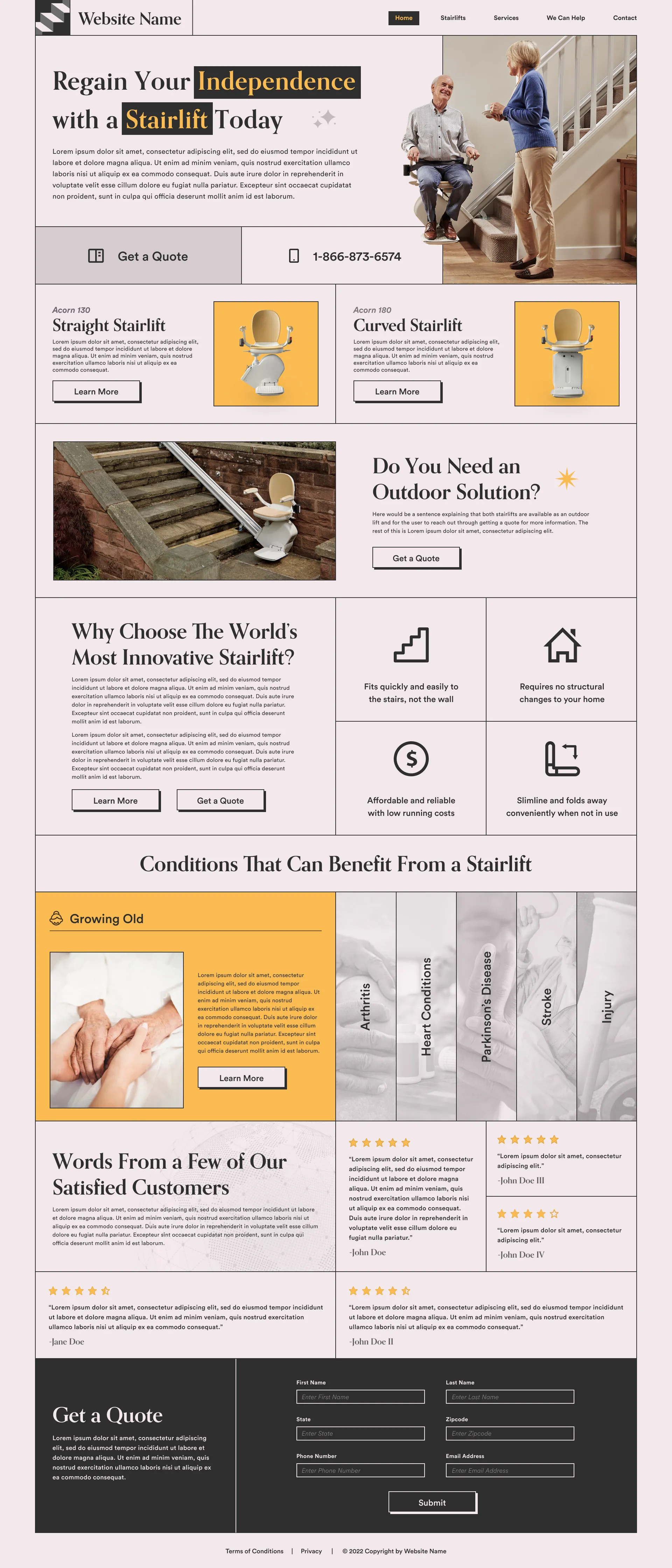
Competing menus, calls to action and dense sections made it hard to find a path through the legacy site, and buying a stairlift is already a sensitive decision. The German site lagged furthest behind the other markets in usability, structure and visual consistency, so the redesign started there.
01Germany first, then everywhere else.
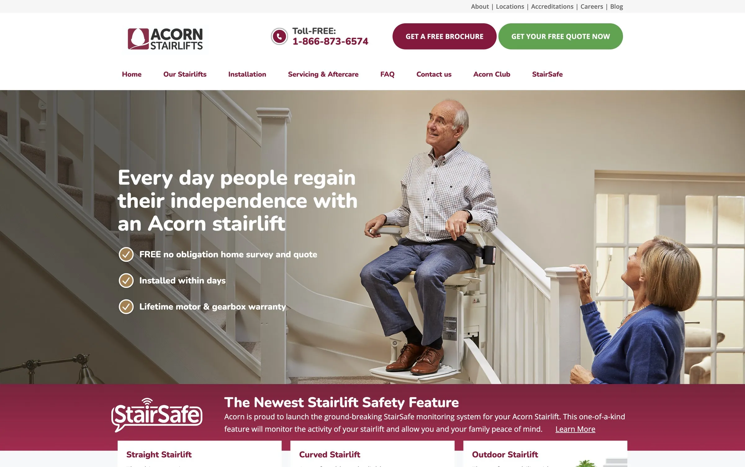
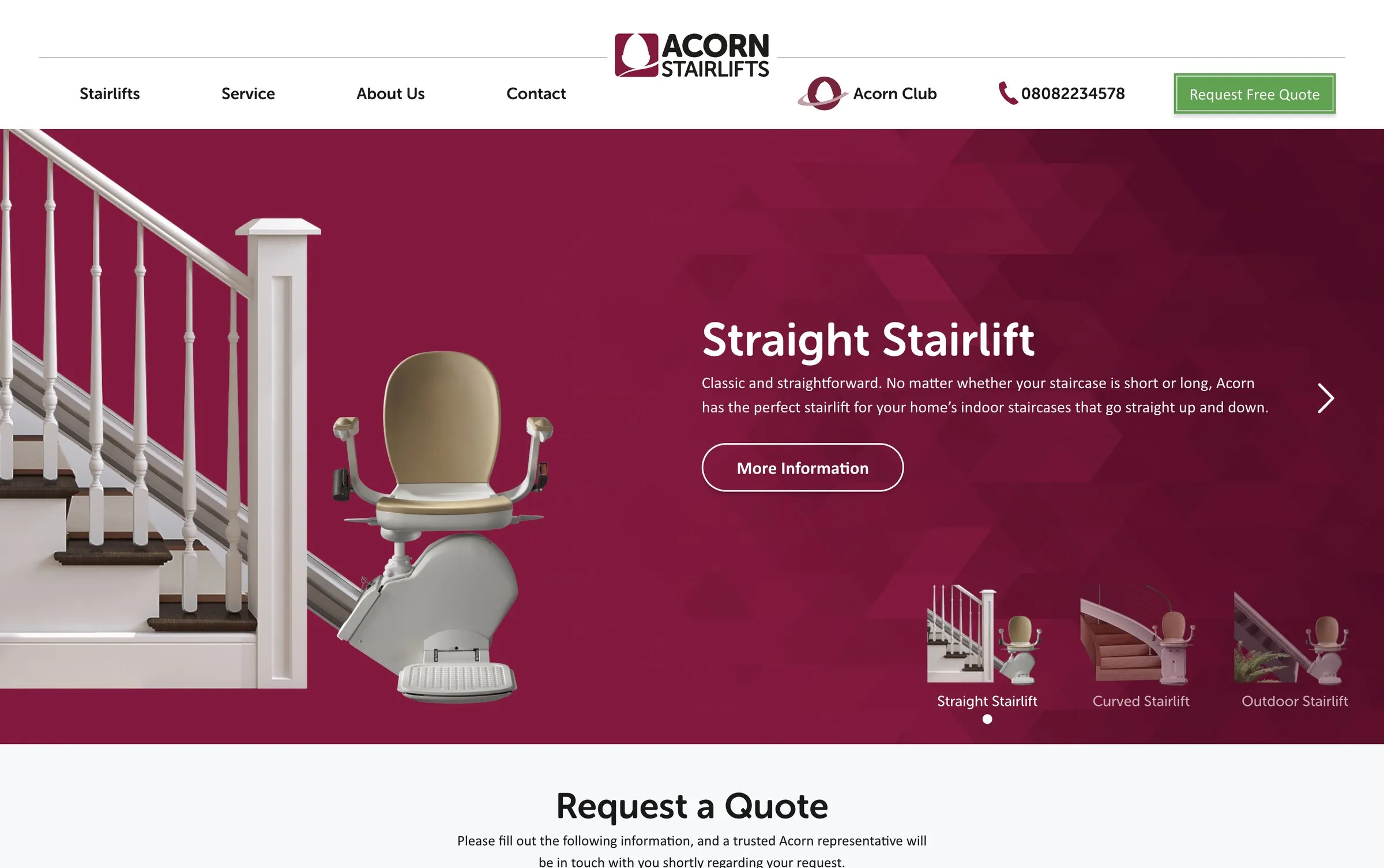
I led the visual direction for the redesign, starting with the German site. Once executives approved it, the direction was adapted for the UK, Italy, the U.S., Canada and smaller regional offices, keeping one brand while meeting each region's requirements and accessibility needs.
02A catalogue organised around intent.
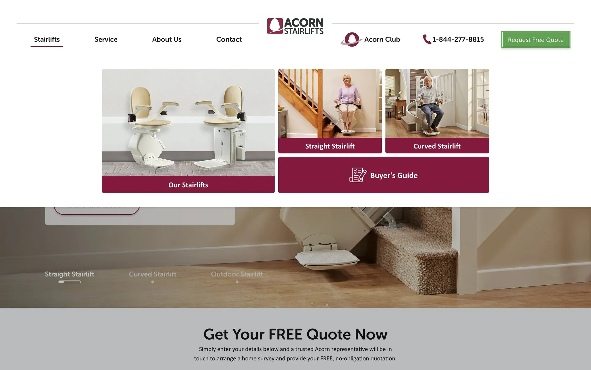
Navigation separates finding a product, getting support as an existing customer and learning about the company, so visitors orient themselves before choosing a next step.
03Products made easier to compare.
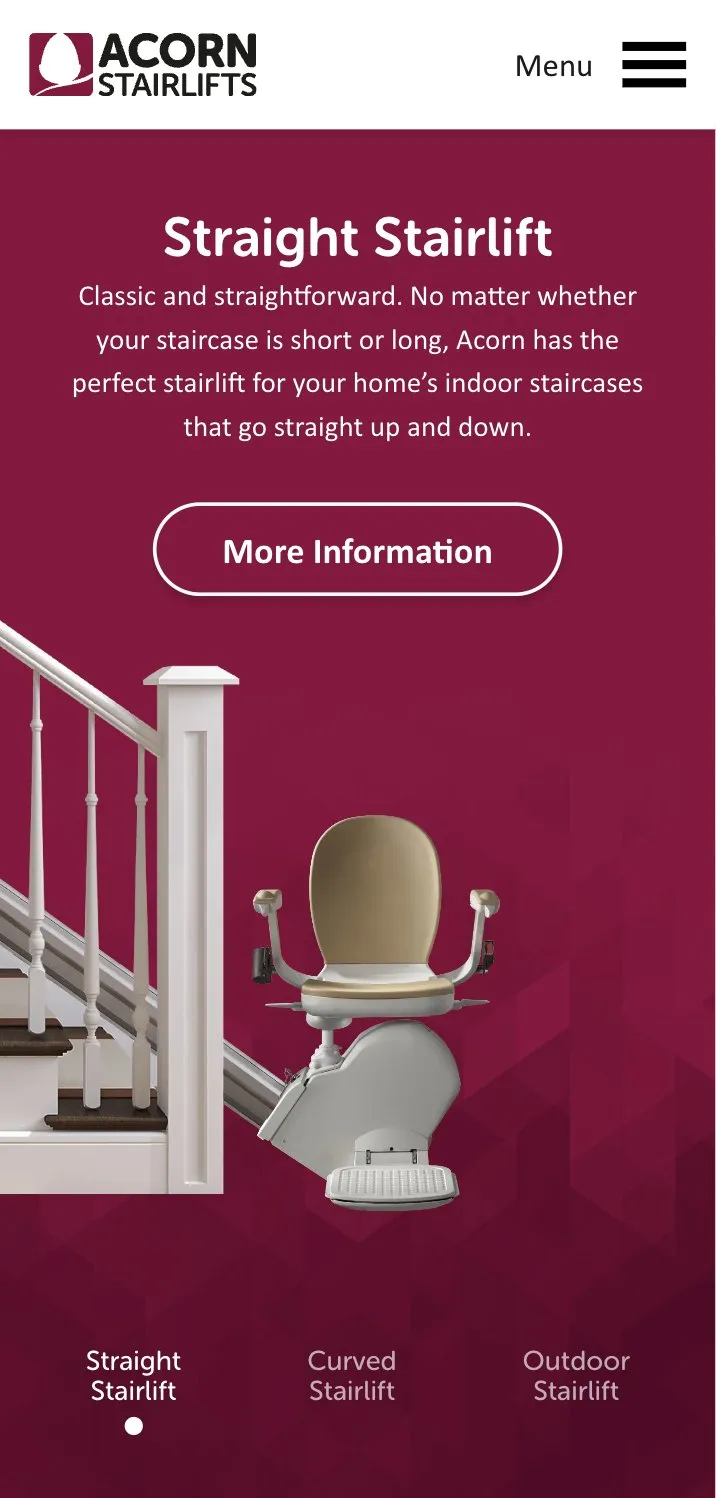
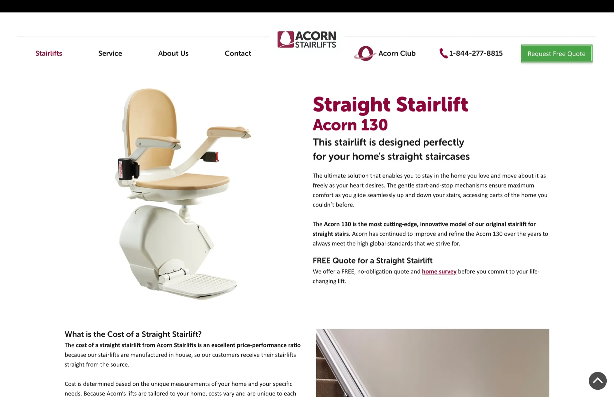
Product pages separate straight and curved stairlifts and translate features into plain benefits, with a consultation always close.
04One guided quote path.
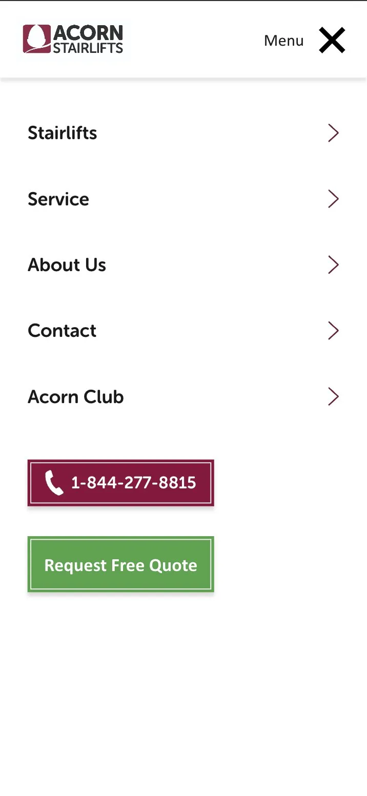
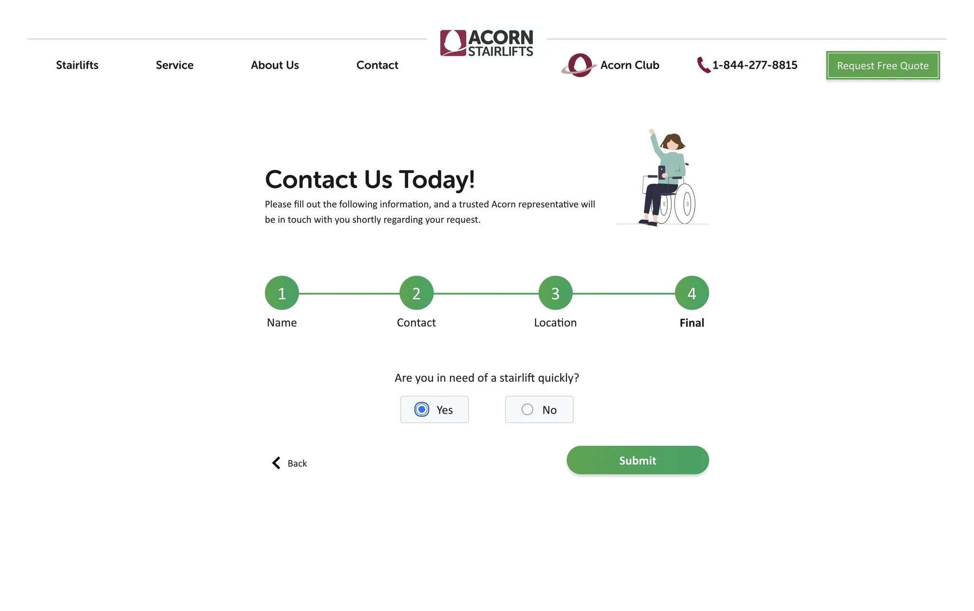
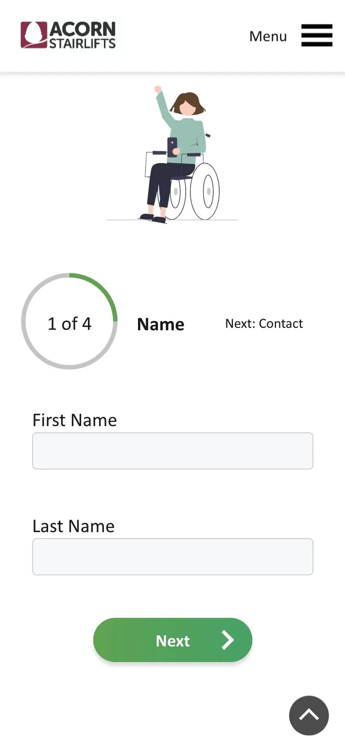
Working side by side with a UX designer and three developers, the quote form became four short steps, consistent from desktop to mobile, so a sensitive request never feels like a wall of fields.
How it was built
A shared interface direction and visual system, adapted market by market by Acorn's UX and development team.
- My part: visual direction, supporting interface assets, the UK homepage hero and close collaboration on the interface system
- UX designer: much of the page-level experience, layout and interaction decisions
- Three developers: implementation
- Markets
- Germany first, then the UK, Italy, the U.S., Canada and regional offices
- Team
- Visual direction (me), a UX designer and three developers
- Quote
- A guided four-step flow on desktop and mobile
The four-step quote journey
- Name
- Contact details
- Location
- Final details and submit
Want work like this for your business?
A few questions, or just call. Either way, you're talking to me.