
01
This was the entire brief.
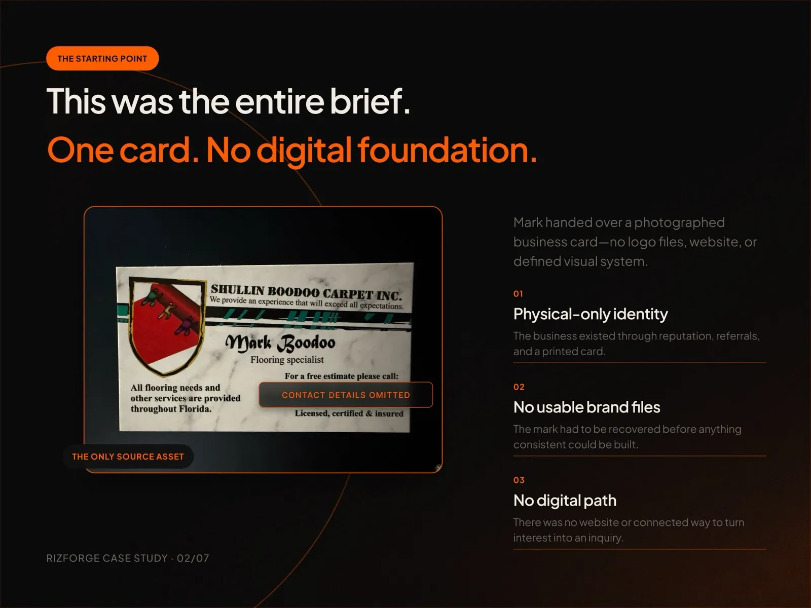
A photographed business card was the only source: a physical-only identity, no usable brand files and no digital path from interest to an inquiry.
 Shullin Boodoo Carpet Inc.Rebrand
The whole brief was one photographed business card. The mark customers already recognised was recovered first, then expanded and turned into a system.
The problem
Mark had decades of reputation, a printed card and nothing else: no logo files, no website and no defined visual system. Nothing consistent could be built until the mark itself was recovered, and it had to stay recognisable to the people who already knew it.
A photographed business card was the only source: a physical-only identity, no usable brand files and no digital path from interest to an inquiry.
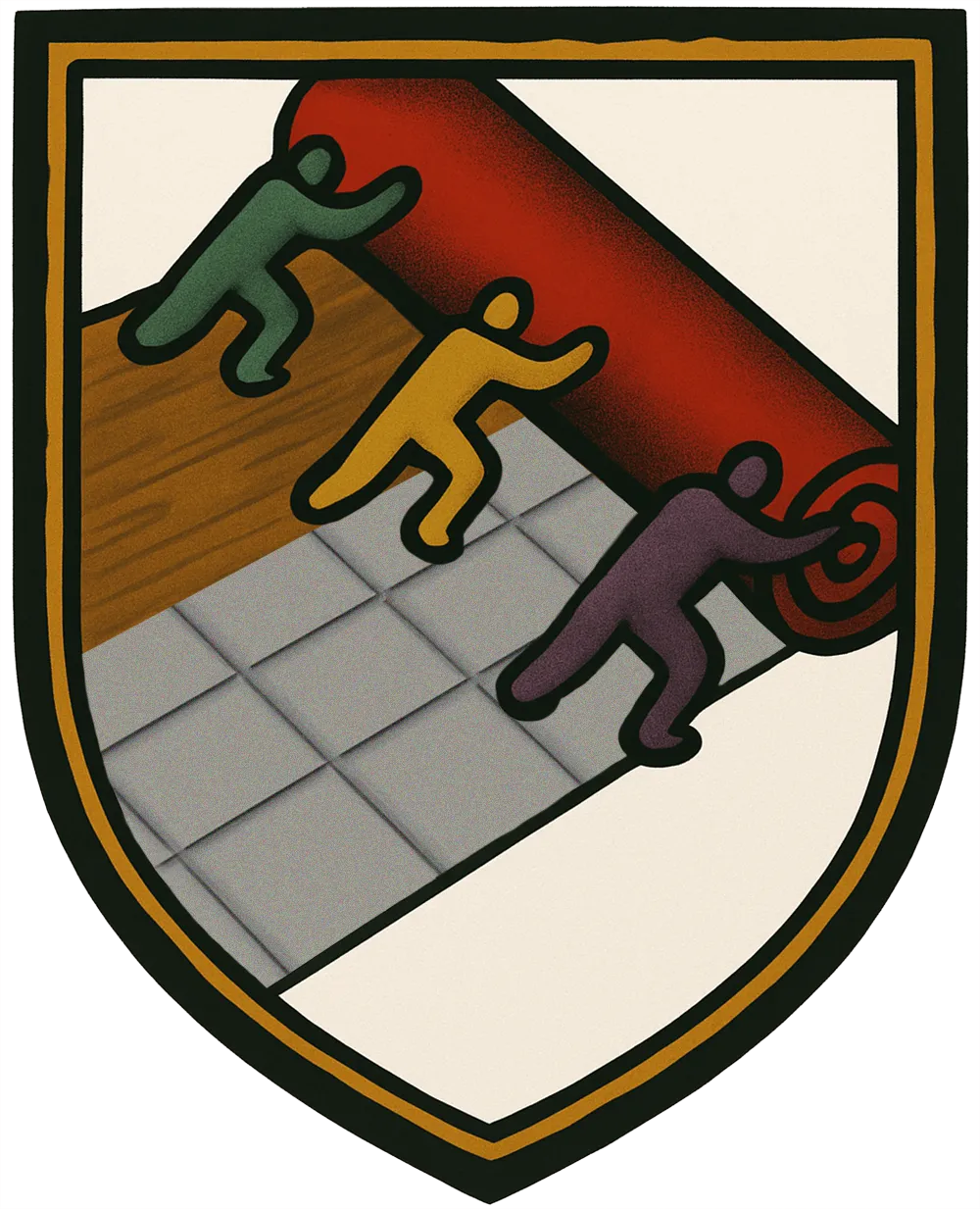
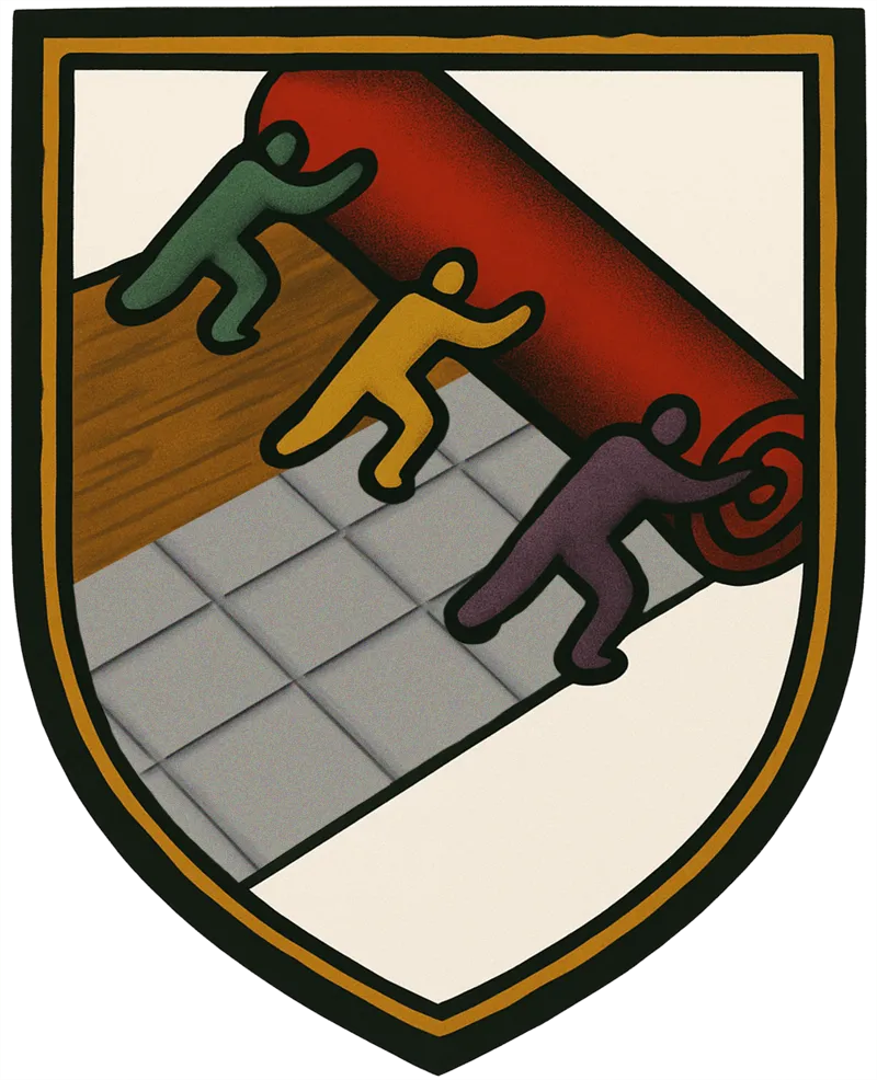
The original shield was reconstructed from the card, then expanded so the three figures roll carpet over wood and tile, covering the full business without discarding what Mark's customers recognised.
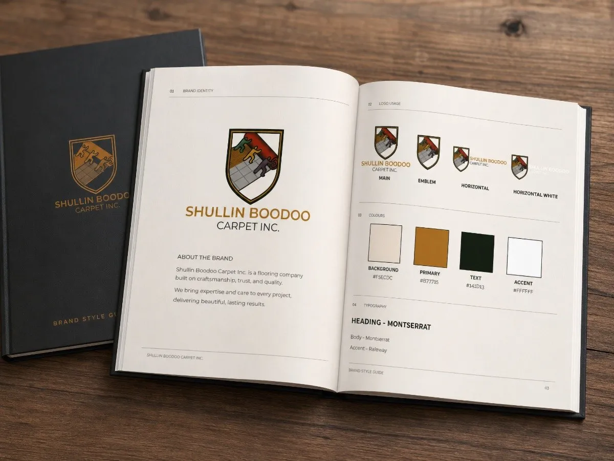
Main, emblem and horizontal versions, black and white variants, colors with exact codes, type rules and a mood board, in one compact brand sheet so every printer or helper uses the brand the same way.
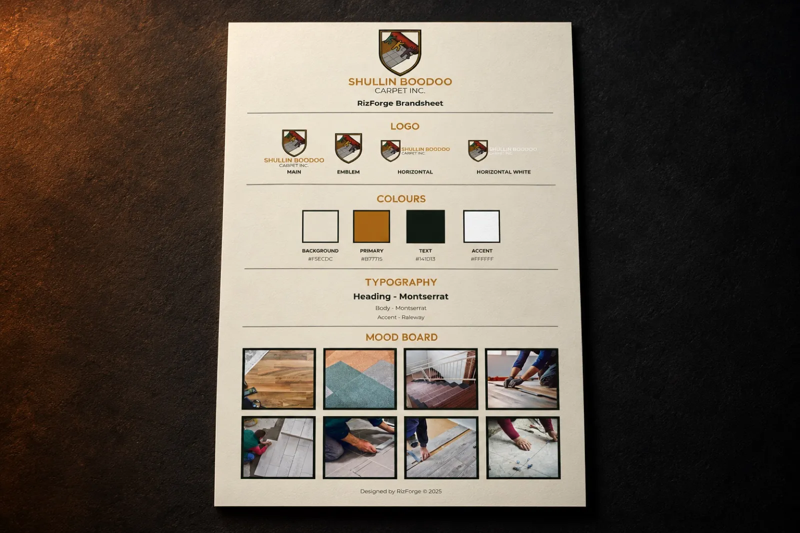
Brand foundations
How it was built
A recovered mark, an expanded logomark, logo versions for every use, a four-color palette and Montserrat for type.
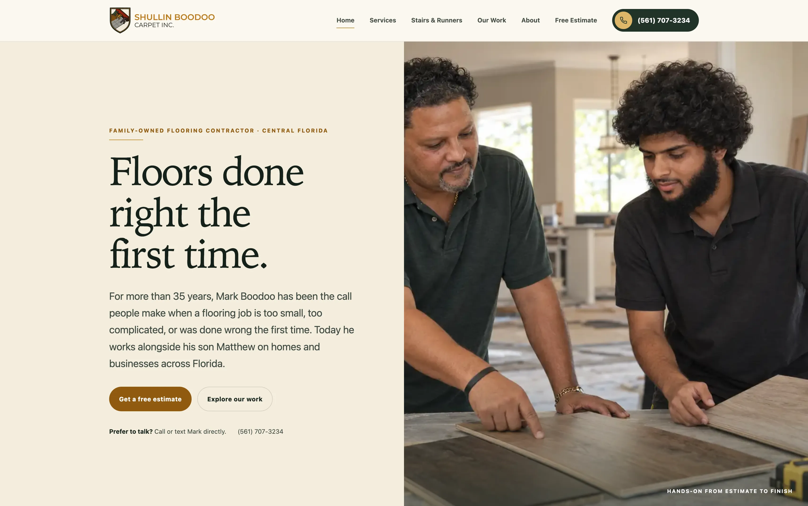
The brand carries straight into the new website, from the warm palette to the shield in the header.
A few questions, or just call. Either way, you're talking to me.