
01
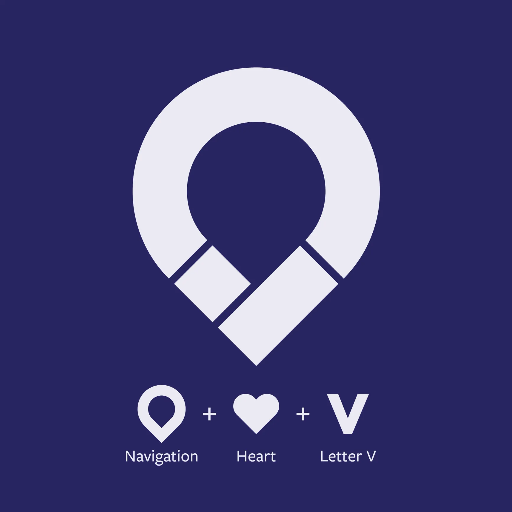
Venture: a pin, a heart and a V.
A map pin, a heart and the letter V, combined into one mark and built out into a full identity.
 Design InteractiveBrand systems
Each product needed a mark that worked on a headset splash screen, a trade-show panel and a slide deck. The company itself needed to stop looking like the late '90s.
The problem
A technology company with many products, three research divisions and a dated late-'90s identity. Each product needed its own recognisable mark, and the company needed one modern system to hold them together.
A map pin, a heart and the letter V, combined into one mark and built out into a full identity.
Beat, Classroom AR and senseAR are a few of the many logos and product brands I made, each built to read on a headset, a booth panel and a slide.
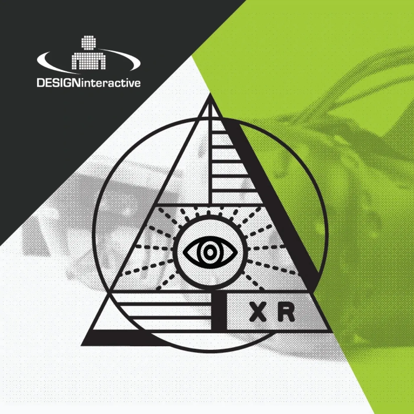
Behavioral science, performance analytics and XR each got an emblem in one shared system, so the divisions read as parts of one company.
With the art director, I pitched and delivered a rebrand that replaced the dated look with a modern logo and design system, then rolled it out to business cards, collateral, presentations, environmental graphics and that year's I/ITSEC booth.

A few questions, or just call. Either way, you're talking to me.